使用Python进行健康监测和分析的案例研究
如何使用案例研究法:选择案例、分析和解释 #生活技巧# #学习技巧# #学术研究方法#
健康监测和分析是指系统地使用健康数据来跟踪和评估个人或人群在一段时间内的健康状况。它包含一系列活动,从实时生理数据收集(如心率,血压和体温)到分析更复杂的健康记录(包括患者病史,生活方式选择和遗传信息)。
数据说明给定的数据集包含不同患者的几个健康相关指标,组织在以下列中:
PatientID:患者的数字标识符。Age:患者的年龄,以年为单位。Gender:患者的性别。HeartRate:心率(每分钟心跳次数)。BloodPressure:血压读数。RespiratoryRate:呼吸频率,单位为每分钟呼吸次数。BodyTemperature:体温,单位为华氏温度。ActivityLevel:测量时的活动水平。OxygenSaturation:氧饱和度百分比。SleepQuality:患者报告的睡眠质量。StressLevel:报告的压力水平。Timestamp:测量的日期和时间。对于健康监测和分析任务,我们的目标是监测数据中患者的健康状况,分析不同类型患者的模式,并根据其健康标准对其进行分组。
该数据集包括来自500个人的健康指标,包括年龄,性别,心率,血压,呼吸频率,体温和血氧饱和度等变量,在特定时期内记录。这些变量提供了每个患者健康状况的全面快照,这对于监测和管理各种健康状况至关重要。
问题传统的健康监测系统通常使用刚性的预定义阈值对患者健康状态进行分类,这些阈值可能无法捕获不同患者人群之间的细微变化。这可能导致评估过于简单,并可能忽视健康数据中微妙而关键的模式。目前的挑战是开发一种更动态和响应性更强的方法,利用无监督学习来识别健康数据中的自然分组,促进个性化和精确的健康管理。
预期结果 已识别的群集:基于健康指标的不同患者群体,每个群体都具有独特的特征,可以深入了解他们的特定健康需求。个性化健康洞察:增强对患者健康需求和风险的了解,实现量身定制的干预策略。改善健康监测:针对每个集群的具体需求提出有针对性的监测和干预战略建议,从而实现更有效的健康管理和更好的患者结果。 使用Python进行健康监测和分析现在,让我们通过导入必要的Python库和数据集来开始健康监控和分析任务:
### 数据集获取: https://pan.baidu.com/s/1IknnFl_wxGG5QPKiCg95qQ?pwd=3x4k import pandas as pd health_data = pd.read_csv('healthmonitoring.csv') print(health_data.head()) 1234
输出
PatientID Age Gender HeartRate BloodPressure RespiratoryRate \ 0 1 69 Male 60.993428 130/85 15 1 2 32 Male 98.723471 120/80 23 2 3 78 Female 82.295377 130/85 13 3 4 38 Female 80.000000 111/78 19 4 5 41 Male 87.531693 120/80 14 BodyTemperature ActivityLevel OxygenSaturation SleepQuality StressLevel \ 0 98.885236 resting 95.0 excellent low 1 98.281883 walking 97.0 good high 2 98.820286 resting 98.0 fair high 3 98.412594 running 98.0 poor moderate 4 99.369871 resting 98.0 good low Timestamp 0 2024-04-26 17:28:55.286711 1 2024-04-26 17:23:55.286722 2 2024-04-26 17:18:55.286726 3 2024-04-26 17:13:55.286728 4 2024-04-26 17:08:55.286731
1234567891011121314151617181920让我们看看数据是否包含任何null值:
health_data.isnull().sum() 1
输出
PatientID 0 Age 0 Gender 0 HeartRate 0 BloodPressure 0 RespiratoryRate 0 BodyTemperature 18 ActivityLevel 0 OxygenSaturation 163 SleepQuality 0 StressLevel 0 Timestamp 0 dtype: int64 12345678910111213
数据在体温和氧饱和度列中包含空值。为了简单起见,将使用中值填充空值:
# calculate medians median_body_temp = health_data['BodyTemperature'].median() median_oxygen_sat = health_data['OxygenSaturation'].median() # fill missing values health_data['BodyTemperature'].fillna(median_body_temp, inplace=True) health_data['OxygenSaturation'].fillna(median_oxygen_sat, inplace=True) 1234567
接下来,我们将检查汇总统计数据和数字健康指标(年龄、心率、呼吸率、体温和氧饱和度)的分布。它将帮助我们了解数据的典型值和分布。将包括一些可视化,以更好地理解这些分布:
import matplotlib.pyplot as plt import seaborn as sns sns.set(style="whitegrid") # summary statistics summary_stats = health_data.describe() # plotting distributions of numerical features fig, axes = plt.subplots(3, 2, figsize=(14, 18)) sns.histplot(health_data['Age'], bins=20, kde=True, ax=axes[0, 0]) axes[0, 0].set_title('Age Distribution') sns.histplot(health_data['HeartRate'], bins=20, kde=True, ax=axes[0, 1]) axes[0, 1].set_title('Heart Rate Distribution') sns.histplot(health_data['RespiratoryRate'], bins=20, kde=True, ax=axes[1, 0]) axes[1, 0].set_title('Respiratory Rate Distribution') sns.histplot(health_data['BodyTemperature'], bins=20, kde=True, ax=axes[1, 1]) axes[1, 1].set_title('Body Temperature Distribution') sns.histplot(health_data['OxygenSaturation'], bins=10, kde=True, ax=axes[2, 0]) axes[2, 0].set_title('Oxygen Saturation Distribution') fig.delaxes(axes[2,1]) # remove unused subplot plt.tight_layout() plt.show()
12345678910111213141516171819202122232425262728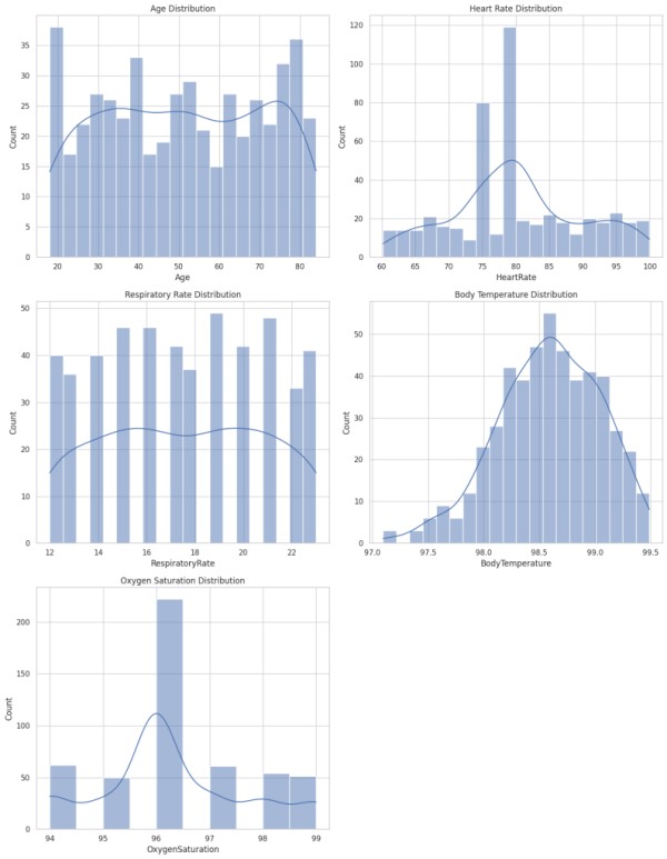
print(summary_stats) 1
输出
PatientID Age HeartRate RespiratoryRate BodyTemperature \ count 500.000000 500.000000 500.000000 500.000000 500.000000 mean 250.500000 51.146000 80.131613 17.524000 98.584383 std 144.481833 19.821566 9.606273 3.382352 0.461502 min 1.000000 18.000000 60.169259 12.000000 97.094895 25% 125.750000 34.000000 75.000000 15.000000 98.281793 50% 250.500000 51.000000 80.000000 17.500000 98.609167 75% 375.250000 69.000000 86.276413 20.000000 98.930497 max 500.000000 84.000000 99.925508 23.000000 99.489150 OxygenSaturation count 500.000000 mean 96.296000 std 1.408671 min 94.000000 25% 96.000000 50% 96.000000 75% 97.000000 max 99.000000
12345678910111213141516171819现在,让我们来看看数据中的性别分布以及数据集中数值列之间的相关性:
# gender Distribution gender_counts = health_data['Gender'].value_counts() # correlation Matrix for numerical health metrics correlation_matrix = health_data[['Age', 'HeartRate', 'RespiratoryRate', 'BodyTemperature', 'OxygenSaturation']].corr() # plotting the findings fig, axes = plt.subplots(1, 2, figsize=(12, 6)) # gender distribution plot gender_counts.plot(kind='pie', ax=axes[0], autopct='%1.1f%%', startangle=90, colors=['#ff9999','#66b3ff']) axes[0].set_ylabel('') axes[0].set_title('Gender Distribution') # correlation matrix plot sns.heatmap(correlation_matrix, annot=True, fmt=".2f", cmap='coolwarm', ax=axes[1]) axes[1].set_title('Correlation Matrix') plt.tight_layout() plt.show()
1234567891011121314151617181920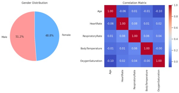
饼图表明,数据集中男性和女性受试者几乎均匀分布,男性占51.2%。相关矩阵显示变量之间没有强相关性,因为所有值都接近于零。具体而言,在该特定数据集中,没有健康指标(年龄、心率、呼吸率、体温和氧饱和度)显示出彼此之间的强正或负线性关系。这表明,对于这组个体,一个指标的变化与其他指标的变化没有很强的关联。
现在,让我们来看看活动水平的心率:
# heart Rate by activity level plt.figure(figsize=(10, 6)) sns.boxplot(x='ActivityLevel', y='HeartRate', data=health_data) plt.title('Heart Rate by Activity Level') plt.ylabel('Heart Rate (beats per minute)') plt.xlabel('Activity Level') plt.show() 1234567
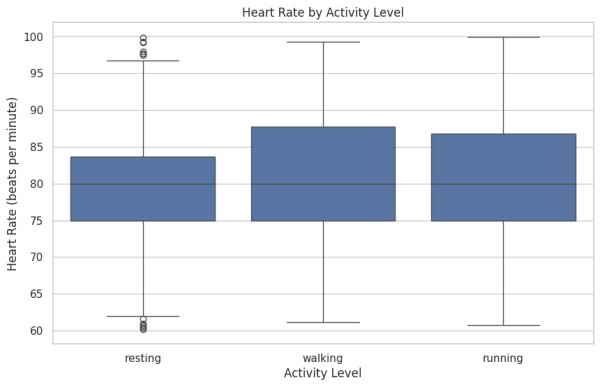
它表明,从休息到步行,心率中位数会增加,这是随着体力活动的增加而预期的。然而,与步行相比,跑步期间的中位心率并没有显著增加,这是不寻常的,因为我们预计更剧烈的活动会有更高的中位心率。此外,步行和跑步之间的四分位数范围有相当大的重叠,表明在抽样人群中这些活动的心率变异性相似。在静息类别中存在离群值表明,一些个体的静息心率远高于该组其他人的典型范围。
现在,让我们来看看血压水平和一些健康指标的性别分布:
# extracting systolic and diastolic blood pressure for analysis health_data[['SystolicBP', 'DiastolicBP']] = health_data['BloodPressure'].str.split('/', expand=True).astype(int) # blood pressure distribution plt.figure(figsize=(12, 6)) sns.histplot(health_data['SystolicBP'], color="skyblue", label="Systolic", kde=True) sns.histplot(health_data['DiastolicBP'], color="red", label="Diastolic", kde=True) plt.title('Blood Pressure Distribution') plt.xlabel('Blood Pressure (mmHg)') plt.legend() plt.show() # health metrics by gender fig, axes = plt.subplots(1, 2, figsize=(14, 6)) sns.boxplot(x='Gender', y='HeartRate', data=health_data, ax=axes[0]) axes[0].set_title('Heart Rate by Gender') axes[0].set_xlabel('Gender') axes[0].set_ylabel('Heart Rate (beats per minute)') sns.boxplot(x='Gender', y='OxygenSaturation', data=health_data, ax=axes[1]) axes[1].set_title('Oxygen Saturation by Gender') axes[1].set_xlabel('Gender') axes[1].set_ylabel('Oxygen Saturation (%)') plt.tight_layout() plt.show()
1234567891011121314151617181920212223242526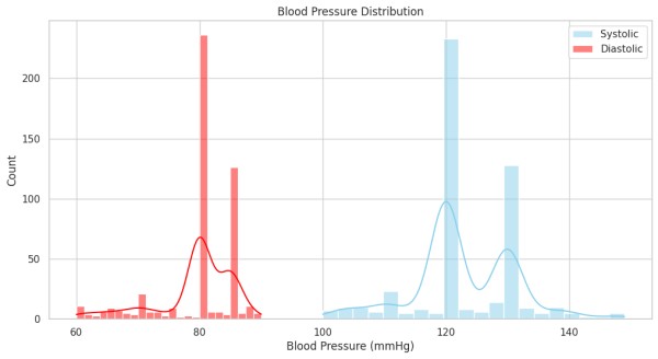
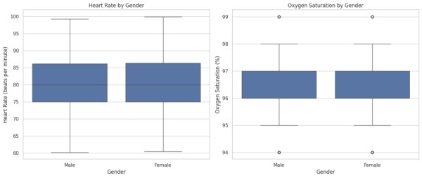
用蓝色表示的收缩压显示了一个更分散的分布,峰值表明常见的读数约为120 mmHg和140 mmHg。舒张压(红色)似乎分布较窄,在80 mmHg左右有一个显著的峰值。收缩压值的范围比舒张压值的范围更广,这是典型的,因为收缩压往往会随着活动水平和压力等因素而变化。该分布与一般人群趋势一致,其中收缩压约为120 mmHg,舒张压约为80 mmHg被视为正常。
对于心率,男性和女性的中位数相似,四分位距相对相似,表明该数据集中性别之间的心率无显著差异。在氧饱和度方面,同样,两种性别表现出几乎相同的中位数和四分位数范围,表明在该样本中,男性和女性之间的氧饱和度没有显著差异。两种性别的血氧饱和度都有一些离群值,表明少数个体低于典型值,但这些似乎不会显著影响总体分布。
现在,让我们通过睡眠质量和压力水平来分析心率和血氧饱和度:
# categorizing sleep quality and stress level for better analysis sleep_quality_order = ['excellent', 'good', 'fair', 'poor'] stress_level_order = ['low', 'moderate', 'high'] # creating plots to examine relationships fig, axes = plt.subplots(2, 2, figsize=(16, 12)) # heart rate by sleep quality sns.boxplot(x='SleepQuality', y='HeartRate', data=health_data, order=sleep_quality_order, ax=axes[0, 0]) axes[0, 0].set_title('Heart Rate by Sleep Quality') axes[0, 0].set_xlabel('Sleep Quality') axes[0, 0].set_ylabel('Heart Rate (beats per minute)') # heart rate by stress level sns.boxplot(x='StressLevel', y='HeartRate', data=health_data, order=stress_level_order, ax=axes[0, 1]) axes[0, 1].set_title('Heart Rate by Stress Level') axes[0, 1].set_xlabel('Stress Level') axes[0, 1].set_ylabel('Heart Rate (beats per minute)') # oxygen saturation by sleep quality sns.boxplot(x='SleepQuality', y='OxygenSaturation', data=health_data, order=sleep_quality_order, ax=axes[1, 0]) axes[1, 0].set_title('Oxygen Saturation by Sleep Quality') axes[1, 0].set_xlabel('Sleep Quality') axes[1, 0].set_ylabel('Oxygen Saturation (%)') # oxygen saturation by stress level sns.boxplot(x='StressLevel', y='OxygenSaturation', data=health_data, order=stress_level_order, ax=axes[1, 1]) axes[1, 1].set_title('Oxygen Saturation by Stress Level') axes[1, 1].set_xlabel('Stress Level') axes[1, 1].set_ylabel('Oxygen Saturation (%)') plt.tight_layout() plt.show()
123456789101112131415161718192021222324252627282930313233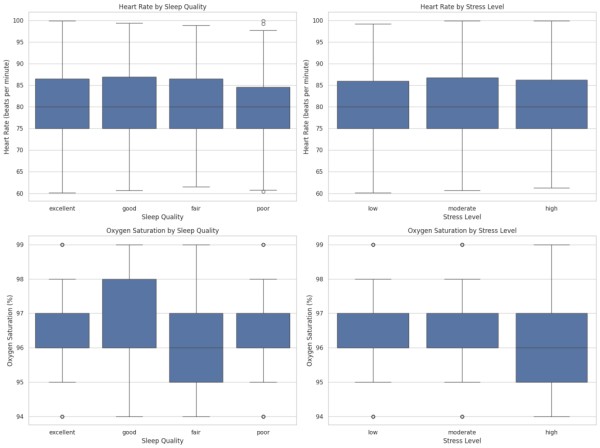
在不同睡眠质量和压力水平下,心率似乎相对一致,而那些报告睡眠不佳的人的心率变化略有增加。氧饱和度显示从优秀到差的睡眠质量的中值的最小降低,其中一些异常值指示优秀和良好睡眠的较低饱和度。当与应激水平相关时,氧饱和度基本保持不变。总的来说,虽然存在异常值,但中心趋势表明,心率和血氧饱和度都不会受到该数据集中睡眠质量或压力水平的很大影响。
现在,让我们通过活动水平来分析呼吸频率和体温:
# creating plots to examine relationships between activity level and other health metrics fig, axes = plt.subplots(1, 2, figsize=(16, 6)) # respiratory rate by activity level sns.boxplot(x='ActivityLevel', y='RespiratoryRate', data=health_data, ax=axes[0]) axes[0].set_title('Respiratory Rate by Activity Level') axes[0].set_xlabel('Activity Level') axes[0].set_ylabel('Respiratory Rate (breaths per minute)') # body temperature by activity level sns.boxplot(x='ActivityLevel', y='BodyTemperature', data=health_data, ax=axes[1]) axes[1].set_title('Body Temperature by Activity Level') axes[1].set_xlabel('Activity Level') axes[1].set_ylabel('Body Temperature (°F)') plt.tight_layout() plt.show()
1234567891011121314151617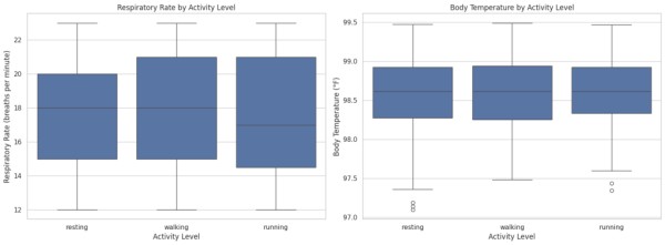
呼吸频率往往随着活动水平的增加而增加,如与休息相比,步行和跑步的中位频率更高所示。它与运动的生理反应一致,呼吸频率增加以满足氧气需求。对于体温,从休息到跑步有轻微上升的趋势,这与体力消耗时身体发热相一致。在休息和跑步时,体温存在异常值,这表明有些人的体温超出了这些活动的典型范围。总体而言,观察到的趋势与对不同活动水平的预期生理反应一致。
数据还没有复杂到我们需要使用聚类算法来对患者进行分组。所以,让我们根据以下因素对患者进行分组:
年龄组:青年,中年,老年血压类别:正常,升高,高血压-1,高血压-2心率类别:低、正常、高血氧饱和度类别:正常,低# function to categorize Age def age_group(age): if age <= 35: return 'Young' elif age <= 55: return 'Middle-aged' else: return 'Senior' # function to categorize Blood Pressure def bp_category(systolic, diastolic): if systolic < 120 and diastolic < 80: return 'Normal' elif 120 <= systolic < 140 or 80 <= diastolic < 90: return 'Elevated' elif 140 <= systolic < 160 or 90 <= diastolic < 100: return 'Hypertension Stage 1' else: return 'Hypertension Stage 2' # function to categorize Heart Rate def hr_category(hr): if hr < 60: return 'Low' elif hr <= 100: return 'Normal' else: return 'High' # function to categorize Oxygen Saturation def oxy_category(oxy): if oxy < 94: return 'Low' else: return 'Normal' # applying categorizations health_data['AgeGroup'] = health_data['Age'].apply(age_group) health_data['BPCategory'] = health_data.apply(lambda x: bp_category(x['SystolicBP'], x['DiastolicBP']), axis=1) health_data['HRCategory'] = health_data['HeartRate'].apply(hr_category) health_data['OxyCategory'] = health_data['OxygenSaturation'].apply(oxy_category) print(health_data[['Age', 'AgeGroup', 'SystolicBP', 'DiastolicBP', 'BPCategory', 'HeartRate', 'HRCategory', 'OxygenSaturation', 'OxyCategory']].head())
12345678910111213141516171819202122232425262728293031323334353637383940414243输出
Age AgeGroup SystolicBP DiastolicBP BPCategory HeartRate HRCategory \ 0 69 Senior 130 85 Elevated 60.993428 Normal 1 32 Young 120 80 Elevated 98.723471 Normal 2 78 Senior 130 85 Elevated 82.295377 Normal 3 38 Middle-aged 111 78 Normal 80.000000 Normal 4 41 Middle-aged 120 80 Elevated 87.531693 Normal OxygenSaturation OxyCategory 0 95.0 Normal 1 97.0 Normal 2 98.0 Normal 3 98.0 Normal 4 98.0 Normal 12345678910111213
现在,让我们可视化这些组:
fig, axes = plt.subplots(2, 2, figsize=(16, 12)) # Age Group count plot sns.countplot(x='AgeGroup', data=health_data, ax=axes[0, 0]) axes[0, 0].set_title('Distribution of Age Groups') # Blood Pressure Category count plot sns.countplot(x='BPCategory', data=health_data, ax=axes[0, 1]) axes[0, 1].set_title('Distribution of Blood Pressure Categories') # Heart Rate Category count plot sns.countplot(x='HRCategory', data=health_data, ax=axes[1, 0]) axes[1, 0].set_title('Distribution of Heart Rate Categories') # Oxygen Saturation Category count plot sns.countplot(x='OxyCategory', data=health_data, ax=axes[1, 1]) axes[1, 1].set_title('Distribution of Oxygen Saturation Categories') # Show the plots plt.tight_layout() plt.show()
123456789101112131415161718192021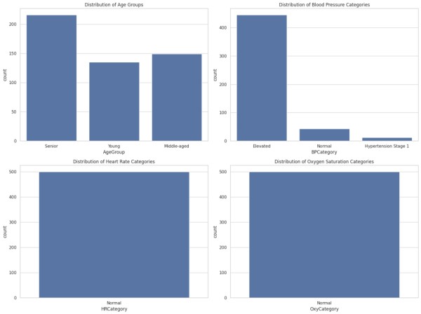
网址:使用Python进行健康监测和分析的案例研究 https://www.yuejiaxmz.com/news/view/755172
相关内容
Python中的生活数据分析与个人健康监测.pptx用Python进行健康数据分析:挖掘医疗统计中的信息
多模态健康监测:融合生物信息和行为数据
基于Python的学生健康数据分析与可视化系统计算机毕设
基于Python的智能健康管理与监测系统设计与实现 毕业设计开题报告
个人健康监测:用数据和建模实现精准健康管理
城市桥群健康监测系统的设计研究
智能家居环境监测的研究分析与控制应用介绍
人工智能与大数据分析的实例研究
数据分析案例:医疗数据分析与预测
随便看看
最新动态分享
- 永年区财政局关于开展倡导绿色生活、反对铺张浪费行动的方案
- 小学生勤俭节约珍惜生活主题班会方案
- 最节省空间的收纳方法
- 日常节约用水的方法有哪一些
- 揭秘低档次财务自由的秘密:如何用小钱实现大梦想
- 世界上没有真正的垃圾.只有放错了地方的资源.现在我们国家正在提倡建设节约型社会.对垃圾进行分类回收.也是节约资源和能源的一种体现.某化学兴趣小组的同学利用废铜制取硫酸铜.设计了如下两个方案:方法一:铜和浓硫酸直接反应.Cu+2H2SO4(浓)═CuSO4+X↑+2H2O方法二:铜在空气中加热生成氧化铜.氧化铜再与稀硫酸反应 题目和参考答案——青夏教育精英家教网——
- 校园环保宣传方案.pptx
- 揭秘玻璃回收:分类奥秘,环保生活从了解开始
- 揭秘:如何用现金存钱打造理财好物,告别月光族,轻松实现财富增长
- 低碳生活模式范本.docx
热点动态分享
- 136564
- 39337
- 36306
- 23789
- 23605
- 23150
- 21413
- 15398
- 14971
- 14937