CSS实现居中布局
如何在小户型中实现多功能布局? #生活技巧# #家居装饰技巧# #装修设计灵感#
一. 水平居中
1. 行内元素
利用text-align只控制行内内容(文字、行内元素、行内块级元素)如何相对它的块父元素对齐, 给其父元素设置 text-align:center,即可实现行内元素水平居中.
.parent {
text-align: center;
}
缺点是子元素宽度大于父元素宽度则无效
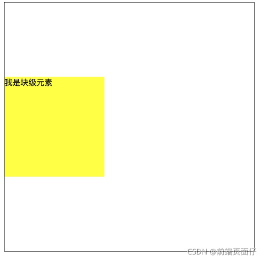
2. 块级元素
html
<style>
.parent {
width: 500px;
height: 500px;
border: 1px solid #000;
}
.child {
background: yellow;
}
</style>
<div class="parent">
<div class="child">我是块级元素</div>
</div>
效果如下:

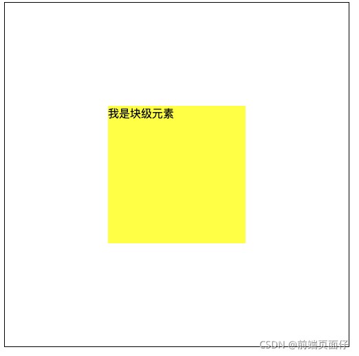
在margin有节余的同时如果左右margin设置了auto,将会均分剩余空间。另外,如果上下的margin设置了auto,其计算值为0
.child {
width: 200px;
margin: 0 auto;
}
缺点是该块级元素必须定宽,并且值不能为auto;且宽度要小于父元素,否则无效;
2.2 使用absolute.parent {
position: relative;
}
使用margin-left
需要知道元素的宽度
.child {
width: 200px;
height: 200px;
position: absolute;
left: 50%;
margin-left: -100px;
background: yellow;
}
使用transform
.child {
height: 200px;
position: absolute;
left: 50%;
transform: translateX(-50%);
background: yellow;
}
使用left:0; right:0; margin: 0 auto;
缺点是需要知道元素的宽度
.child {
width: 200px;
height: 200px;
position: absolute;
left: 0;
right: 0;
margin: 0 auto;
background: yellow;
}
2.3 使用flexflex + justify-content
.parent {
display: flex;
justify-content: center;
}
flex + margin
.parent{
display: flex;
}
.child {
margin: 0 auto;
}
2.4 使用gridgrid + margin
.parent{
display: grid;
}
.child {
margin: 0 auto;
}
grid + justify-content
.parent{
display: grid;
justify-content: center;
}
二. 垂直居中
1. 行内元素
利用line-height
原理:line-height的最终表现是通过inline box实现的,而无论inline box所占据的高度是多少(无论比文字大还是比文字小),其占据的空间都是与文字内容公用水平中垂线的。
.parent {
height: 100px;
line-height: 100px;
}
对图片居中
.parent {
height: 100px;
line-height: 100px;
font-size: 0;
}
.parent img {
vertical-align: middle;
}
2. 块级元素
.parent {
display: table-cell;
vertical-align: middle;
}
缺点: 设置tabl-cell的元素,宽度和高度的值设置百分比无效,需要给它的父元素设置display: table; 才生效;table-cell不感知margin,在父元素上设置table-row等属性,也会使其不感知height;设置float或position会对默认布局造成破坏,可以考虑为之增加一个父div定义float等属性;内容溢出时会自动撑开父元素。
2.2 使用absolute.parent {
position: relative;
}
使用margin-top
需要知道元素的高度
.child {
width: 200px;
height: 200px;
position: absolute;
top: 50%;
margin-top: -100px;
background: yellow;
}
使用transform
.child {
height: 200px;
position: absolute;
top: 50%;
transform: translateY(-50%);
background: yellow;
}
使用top:0; bottom:0; margin: auto 0;
缺点是需要知道元素的宽度
.child {
width: 200px;
height: 200px;
position: absolute;
top: 0;
bottom: 0;
margin: auto 0;
background: yellow;
}
2.3 使用flexflex + align-items
.parent {
display: flex;
align-items: center;
}
flex + margin
.parent{
display: flex;
}
.child {
margin: auto 0;
}
2.4 使用gridgrid + margin
.parent{
display: grid;
}
.child {
margin: auto 0;
}
grid + align-items
.parent{
display: grid;
align-items: center;
}
三. 水平垂直居中
1. 行内/行内块级/图片
text-align + vertical-align.parent {
height: 100px;
line-height: 100px;
font-size: 0;
text-align: center;
}
.child {
vertical-align: middle;
}
利用table-cell.parent {
display: table-cell;
vertical-align: middle;
}
.child {
width: 100px;
height: 50px;
}
2. 块级元素
2.1.1 父元素table-cell(元素宽高不确定无影响)
.parent {
height: 100px;
text-align: center;
display: table-cell;
vertical-align: middle;
}
.child {
display: inline-block;
}
2.1.2 绝对定位
.parent {
position: relative;
}
子元素负magin值
.child {
width: 200px;
height: 200px;
position: absolute;
left: 50%;
top: 50%;
margin-left: -100px;
margin-top: -100px;
background: yellow;
}
子元素使用transform(元素宽高不确定无影响)
.child {
width: 200px;
height: 200px;
position: absolute;
left: 50%;
top: 50%;
transform: translate(-50%, -50%);
background: yellow;
}
子元素使用top/right/bottom/left + margin
.child {
width: 200px;
height: 200px;
position: absolute;
top: 0;
right: 0;
bottom: 0;
left: 0;
margin: auto;
background: yellow;
}
父元素使用flex+ justify-content + align-items(元素宽高不确定无影响)
.parent {
display: flex;
justify-content: center;
align-items: center;
}
父元素flex + 子元素margin: auto(元素宽高不确定无影响)
.parent {
display: flex;
}
.child {
width: 200px;
height: 200px;
margin: auto;
background: yellow;
}
父元素grid + justify-content + align-items(元素宽高不确定无影响)
.parent {
display: grid;
justify-content: center;
align-items: center;
}
父元素grid + 子元素margin: auto(元素宽高不确定无影响)
.parent {
display: grid;
}
.child {
width: 200px;
height: 200px;
margin: auto;
background: yellow;
}
2.2 未知宽高父元素table-cell + 子元素display: inline-block
子元素使用transform
父元素使用flex+ justify-content + align-items
父元素flex + 子元素margin: auto
父元素grid + justify-content + align-items
父元素grid + 子元素margin: auto
欢迎查看其他布局系列文章
CSS实现居中布局
CSS实现两列布局
CSS实现三列布局
参考资料:干货!各种常见布局实现+知名网站实例分析 - 掘金
网址:CSS实现居中布局 https://www.yuejiaxmz.com/news/view/170530
相关内容
CSS+JavaScript实现页面不同布局的切换 « 张鑫旭html网页制作——HTML节日主题网页项目的设计与实现——圣诞节日介绍(HTML+CSS)
CSS 清理浮动 clear属性
Web网页基于html、CSS设计——“爱家居”素材
妙法攻略:渐变虚框及边框滚动动画的纯CSS实现 « 张鑫旭
如何从室内设计效果图中获取灵感,实现家居布局?
爱家居网页制作 网页设计与制作html+css+javascript)项目4
巧用CSS cross
现代家居生活的布局窍门
随心所欲的装修布局:个性化家居的实现之道
随便看看
最新动态分享
- 环保不只是口号!这5个日常小习惯,让你轻松为地球“减负”!
- 绿色环保小常识(8篇)
- 日常绿色低碳生活小常识
- 日常生活中的环保行为
- 绿色健康的生活方式有哪些
- 绿色生活有哪些
- 建立绿色生活习惯
- 文明健康,绿色环保主题班会教案3篇
- 长沙卢浮社区:绿色理念进家庭 厚植环保新文明
- 材料工程学院举办“绿韵新创,趣享生活”绿色环保主题讲座
热点动态分享
- 2087
- 1980
- 1901
- 1770
- 1456
- 1396
- 1392
- 1240
- 1106
- 1102